Have you ever given a second chance to a mobile app which did not come up to your expectations the first time? Well, only 16% of mobile app users give more than two chances to a mobile app which failed to deliver a wonderful user experience, while 79% might consider giving it more than one try. Source: Dynatrace.com
Don’t you think, leaving your app to face the fate at hands of 79% could prove disastrous for your business and might also result in losing some good customers?
Why not make it right the first time?
Are you wondering right now, that’s exactly what we want to do, but HOW is a bigger question?
That is why we are here, we at iTool Solutions will answer this HOW for you and, to begin with let us first understand the biggest dilemma of mobile app development:
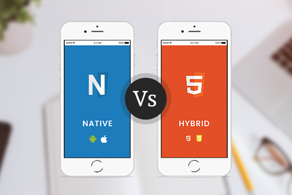
Let us first understand what a Native app and Hybrid app is.
A native application is a mobile device application that is particularly developed for a mobile operating system for eg. Objective-C or Swift for iOS, Java for Android, and so on.Such an app is developed under a mature ecosystem following the technical and user experience guidelines. It gives a faster performance and feels consistent with almost all other native apps on the device. It delivers far better and intuitive user experience.
Hybrid applications are websites wrapped into a native cover. They seem like a native app but actually reside outside of the basic frame of the application. Ultimately, this is a web app built using HTML5 and JavaScript, wrapped in a native container, which displays and downloads the information sought by the user as the user navigates through the application. Simple advantage of the Hybrid application is that it is not OS dependent, hence once designed it can run on any mobile device.
More confused? Don’t be, this thorough comparison will help you choose sides!
Key comparison points for Native vs Hybrid apps include:
| Parameter(s) | Native App | Hybrid App |
| User Experience | Very High | High/Medium |
| Technology | Developed in OS specific language. For eg. Objective-C or Swift for iOS, Java for Android | Developed using HTML, CSS, Javascript. Some examples of hybrid mobile frameworks include Ionic, NativeScript, React Native, Xamarin, PhoneGap etc. |
| Compatibility | OS Specific. Multiple OSes, multiple applications. | Develop Once, Run Everywhere. |
| Performance | Fastest | Medium to Comparable with Native Apps |
| In-App Interaction | Very High | Medium |
| Inherent Device/OS Feature Inclusion | Very High. Makes use of inherent device features like GPS, address book, camera, etcetera | Medium |
| Security | Very High | Medium/Low |
| Development Time | 4-8 Weeks for a standard mobile app on one platform. | Faster Development Cycle. Possible to deploy a standard feature mobile app as soon as within 4 weeks. |
| Post Development Maintenance | Requires platform wise maintenance and updates. | Simple to maintain. |
| ROI | High. Primarily due to higher index of user experience & intuitiveness delivered by the native apps. |
High/Medium |
The most important aspect to be considered when deciding which app technology is ideal for your business is to define the objectives you want to achieve by developing this app. While defining these objectives, do keep in mind that ultimately your app will be used by the end user who could be your customer or an employee based on the type of app you are envisioning.
Keep in mind your app user’s experience because Customer experience is primitive to mobile app development today. Unless your app delivers an intuitive & wonderful user experience, it may still be thrown into the trash the next moment irrespective of the fact that it delivers most useful content for the user.
We at iTool Solutions as your technology partner guide you through this selection process, helping you select the best option suitable for your business objectives. Talk to our experts and find out which is the best app for your business: Native or Hybrid?
Liked the article? Share it with your colleagues and peers. Stay tuned and watch out for upcoming articles in this space.


